I know, it's been a while. I was doing so well...for about a week. But here I am again. Lots has been going on with school and at home and such. So much to do! I'm working on quite a few different projects, some for school, some for family and friends, and then also on getting my studio/working area up and running. I'll post about all of those, but for now, I'd like to introduce you all to something that is completely awesome.
Amazon has wish lists you can make public. I love it! I think everyone should log into Amazon and create a public wish list of all the great books they want so that when someone is completely lost when it comes to getting you a gift for, say, Christmas or your birthday, they can all go there and get you something you really do want.
Yay! All you have to do is search for the person's name, and voila, there's the list. If you have a common name, it helps to add a few details. There's another Leah with my last name in CT. I'm not alone.
Ok. So, just when you thought that's all there is to it and that's as good as it gets, don't worry, it gets better. You can "get a wish list button" which will somehow or another let you add things you want from other websites too, not just Amazon. I'm not sure how it works, but they explain it
here. I haven't done that yet, but I think it would make life easier for people! Anyway, if you're interested to see what books I'm currently salivating over, view my
wish list. Or, if you're feeling adventurous, just go to
amazon.com and see if you can figure it out. Don't be scared. It's easy. I'll even give you a hint: click on "gifts and wish lists" at the top and then type my name in on the right. As easy as that. I think I'll go add more books now.


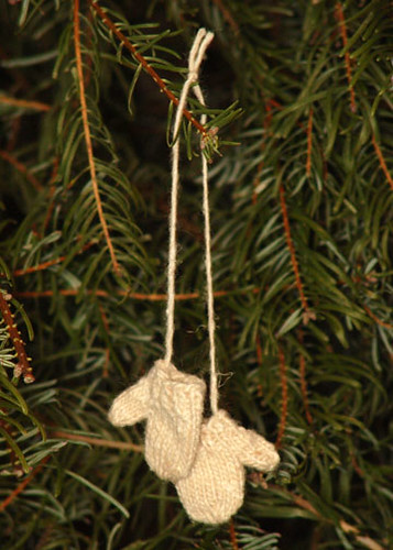
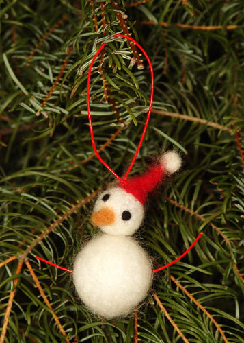 Felted snowman from "nysa."
  Two headed dear from Jane Wynn.
 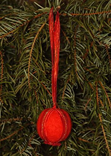 Red felted ball from "etiecke."
 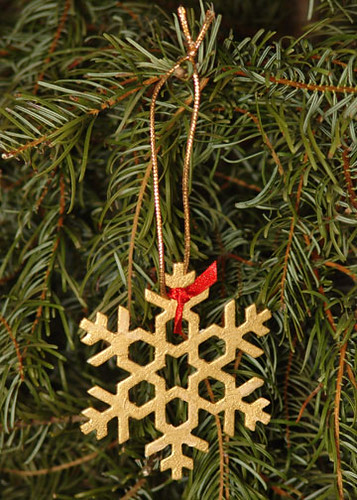 Golden snowflake from "MonkeysInk."
 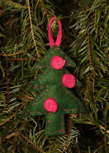 Felt tree from "dianedundee."
 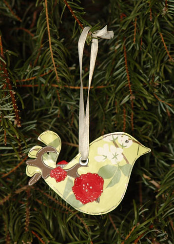 Paper Bird from Paper Lady Invites.
 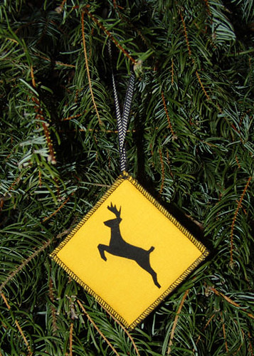 Dear Crossing! From Zebula Designs.


 I was at the
  The text reads:
 You guessed it. You have to line up the little pieces, add spacing between words, and leading between lines. Takes some time, but gives you some appreciation for what people used to do back in the day. When there's a letter that's worn down, you have to replace it. If you run out of
 I love the coordinating style and colors of the two posters, with the images representing the letters and the repetition of the images representing the numbers. Each is available in a variety of other color combinations as well. Creative
  The second poster quite charming with different shades of brown and different sizes for the letters, and a crisp aqua color added in with the clean illustrations, which seems to be an Isak signature color, giving a pop.
 Today we
 If you keep your eyes open, all sorts of great shapes and images appear right
 Here's another poster I really like. The style is quite different than the previous two, but I like it all the same. It was designed by
 I love the colors (although it comes in